

TL;DR:
- Mobile optimization is essential for improving site performance, user experience, and search rankings. It reduces bounce rates and increases conversions by delivering faster, more accessible content tailored for mobile devices. Continuous testing and refinement are crucial to keep pace with evolving user expectations and technology.
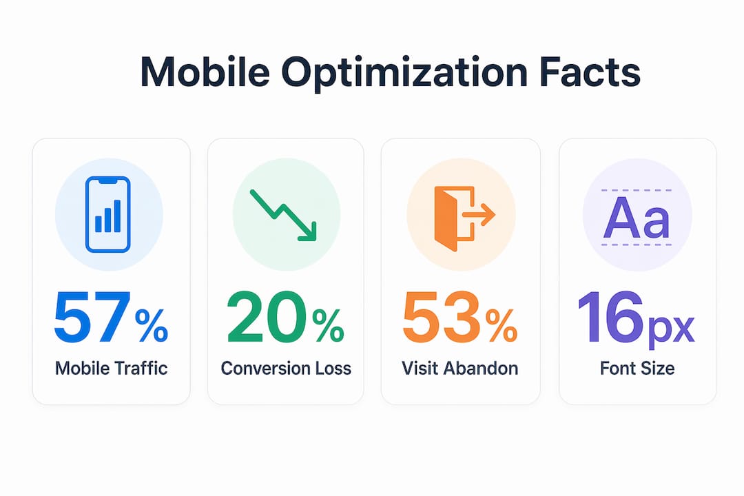
Mobile optimization is the process of designing and improving digital experiences specifically for mobile devices to maximize performance, usability, and conversion rates. With mobile devices generating over 57% to 60% of global web traffic, mobile is now the primary channel for customer interaction. Platforms like Google, Shopify, and Klaviyo have all restructured their core systems around mobile behavior. For business professionals and marketers, the question is no longer whether to prioritize mobile optimization. The question is how fast you can close the gap between your current site and what mobile users actually expect.
Why prioritize mobile optimization for SEO rankings?
Google’s mobile-first indexing means the mobile version of your site is what Google reads and ranks. Your desktop site can be flawless, but a poor mobile experience directly lowers your overall search visibility. This is not a secondary concern. It is the primary ranking signal.
The performance consequences are measurable. A 1-second delay in mobile load time can reduce conversions by up to 20%. Every additional second compounds that loss. For an eCommerce store generating $50,000 per month, a two-second delay is not a technical inconvenience. It is a revenue problem.
Core Web Vitals, Google’s set of page experience metrics, are directly tied to mobile performance. Metrics like Largest Contentful Paint and Cumulative Layout Shift measure exactly what mobile users feel when a page loads. Slow, unstable pages score poorly, and poor scores push rankings down. The SEO trends shaping 2026 confirm that Core Web Vitals are now a non-negotiable ranking factor for online stores.
Key SEO factors affected by mobile performance include:
- Page load speed: Directly tied to bounce rate and Google ranking signals
- Bounce rate: High mobile bounce rates signal poor user experience to Google
- Crawlability: Google’s crawler uses a mobile user agent, so hidden or broken mobile content goes unindexed
- Core Web Vitals scores: Poor scores on mobile reduce ranking potential across all devices
What user experience factors does mobile optimization improve?
Mobile users expect fast, scannable content with appropriately sized interface elements. When a site fails to deliver that, users leave. The average mobile visitor makes a judgment about your brand within seconds of landing on your page.

Speed is the most critical factor. 53% of mobile visits are abandoned if a page takes longer than 3 seconds to load. That statistic means more than half your paid traffic, organic traffic, and email clicks can disappear before a single product is viewed. Every second you shave off load time directly protects that traffic.
Touch navigation, font size, and layout are equally important. Font sizes smaller than 16px on iOS trigger auto-zoom, which breaks the layout and frustrates users. This is one of the most overlooked fixes in mobile design. A single CSS rule setting the base font to 16px prevents a layout disaster that costs you customers.
Pro Tip: Test your mobile site on a real device with a throttled 4G connection, not just Chrome DevTools. Users on weaker signals experience your site very differently than your office Wi-Fi suggests.
The full customer journey must work on mobile, from the first search result to checkout confirmation. Hard-to-find FAQ sections and contact pages on mobile cause drop-off at the exact moment a customer needs reassurance. Mobile optimization for better user experience means removing every point of friction between discovery and purchase.
Essential mobile UX factors to address:
- Touch targets at least 44×44 pixels to prevent mis-taps
- Single-column layouts that eliminate horizontal scrolling
- Sticky navigation or a visible back-to-top button for long pages
- Simplified checkout with autofill support and mobile payment options like Apple Pay or Google Pay
- Accessible FAQ and support pages that load fast and are easy to scan
Mobile-first design vs. responsive design: what is the difference?
Responsive design adapts a desktop layout to fit smaller screens. Mobile-first design starts with the smallest screen and builds up. The distinction matters because the starting point determines what gets prioritized.
Starting design with mobile constraints removes unnecessary scripts and assets that desktop designs accumulate. The result is a leaner codebase, faster load times, and better Core Web Vitals scores across every device. Responsive design can still carry desktop bloat onto mobile. Mobile-first design eliminates it at the source.
| Approach | Starting point | Performance impact | Content priority |
|---|---|---|---|
| Responsive design | Desktop layout | Desktop assets load on mobile | Desktop content hierarchy |
| Mobile-first design | Mobile constraints | Only essential assets load | Mobile-critical content first |
Mobile-first design improves inclusivity by creating efficient experiences for users who rely solely on mobile devices. In many markets, mobile is the only device a customer owns. A mobile-first approach serves those customers by default, not as an afterthought.
Progressive enhancement is the method that makes mobile-first practical. You build the core experience for mobile, then layer on richer features for tablet and desktop. This approach means your baseline experience is always fast and functional. Desktop users get more. Mobile users never get less.
Pro Tip: Run Google’s PageSpeed Insights on your mobile URL specifically. The mobile score is almost always lower than desktop, and the recommendations are specific enough to act on immediately.
How can businesses implement mobile optimization for eCommerce growth?
Effective implementation follows a clear sequence. Start with the factors that have the highest impact on both SEO and conversion, then build from there.
- Audit your current mobile speed. Use Google PageSpeed Insights or GTmetrix to get a baseline score. Focus on Time to First Byte and Largest Contentful Paint as your primary targets.
- Compress and properly size images. Oversized images are the single most common cause of slow mobile load times. Use WebP format and serve images at the exact dimensions they display.
- Set base font size to 16px. This one change prevents iOS auto-zoom and immediately improves the reading experience.
- Simplify your mobile navigation. Reduce menu depth to two levels maximum. Use a hamburger menu only if the icon is clearly labeled.
- Optimize your checkout flow. Remove unnecessary form fields. Enable autofill. Add mobile payment options. Each step you remove from checkout increases the chance a mobile user completes the purchase.
- Make support accessible on mobile. Your FAQ, live chat, and contact page must load fast and be easy to find. Customers who cannot get answers quickly leave and do not return.
- Test continuously. Continuous optimization is critical because user expectations and technology evolve rapidly. What worked in 2024 may not hold in 2026.
Personalization is the next layer. Tools like Klaviyo allow you to trigger mobile-specific email and SMS flows based on browsing behavior, cart abandonment, and purchase history. A customer who abandons a cart on mobile can receive a personalized SMS within minutes. That kind of frictionless mobile experience is what converts mobile traffic into actual revenue.
Metrics to track after implementation:
- Mobile bounce rate (target below 50%)
- Mobile conversion rate compared to desktop
- Average page load time on mobile (target under 3 seconds)
- Core Web Vitals scores in Google Search Console
- Revenue attributed to mobile sessions
The role of website speed in eCommerce growth is well documented. Faster mobile sites reduce cart abandonment and increase the likelihood of repeat purchases. Speed is not a technical metric. It is a revenue metric.
Key Takeaways
Mobile optimization is the single highest-leverage investment an eCommerce brand can make in 2026, because it directly controls SEO rankings, conversion rates, and brand perception simultaneously.
| Point | Details |
|---|---|
| Mobile drives the majority of traffic | Over 57% of global web traffic comes from mobile devices, making it the primary customer channel. |
| Speed determines conversions | A 1-second mobile load delay reduces conversions by up to 20%; target under 3 seconds total load time. |
| Google ranks your mobile site | Mobile-first indexing means your mobile performance controls your search rankings, not your desktop site. |
| Mobile-first beats responsive | Starting design from mobile constraints removes bloat and improves Core Web Vitals across all devices. |
| Optimization is ongoing | User expectations and technology shift constantly; continuous testing is required to maintain performance gains. |
Mobile optimization in 2026: what I have learned the hard way
The biggest mistake I see eCommerce brands make is treating mobile optimization as a one-time project. They fix the obvious issues, see an improvement in their PageSpeed score, and move on. Six months later, a new plugin has added 200KB of JavaScript to every page and the score has collapsed again.
Mobile optimization is a discipline, not a task. The brands that win on mobile treat it the same way they treat email deliverability or ad spend. They monitor it weekly, they test changes before shipping them, and they have someone accountable for the number.
The second thing I have learned is that the UX details matter more than most marketers realize. A 16px font size, a properly sized tap target, a checkout form that supports autofill. None of these feel like big wins individually. Together, they are the difference between a 1.2% mobile conversion rate and a 3.4% one. That gap is not a design preference. It is compounding revenue.
The role of automation in mobile experience is also growing fast. Klaviyo’s SMS and push notification capabilities mean you can reach customers at the exact moment they are already on their phone. But those messages only convert if the page they land on is fast and frictionless. The marketing and the site have to work together. One without the other is money left on the table.
My honest advice: pull your Google Search Console data right now and look at your mobile Core Web Vitals. If more than 25% of your URLs are in the “Poor” category, that is your highest-priority growth lever. Fix the site before you spend another dollar on paid traffic.
— Leon
How Swyftinteractive helps eCommerce brands grow with mobile-first design
Swyftinteractive builds high-converting eCommerce websites designed for mobile performance from the ground up, paired with Klaviyo automation that turns mobile visitors into repeat customers.

If your mobile site is slow, your rankings suffer and your paid traffic converts poorly. Swyftinteractive’s approach combines fast-loading eCommerce website design with full-funnel automation, so every mobile visitor gets a fast experience and a personalized follow-up. The eCommerce website checklist with Klaviyo automation is a practical starting point for brands ready to close the gap between their current mobile performance and what their customers actually expect.
FAQ
Why does mobile optimization matter for SEO?
Google uses mobile-first indexing, meaning it ranks your site based on the mobile version. A slow or incomplete mobile site directly lowers your search rankings, even if your desktop site performs well.
How does page speed affect mobile conversions?
A 1-second delay in mobile load time reduces conversions by up to 20%. Faster pages keep users engaged and reduce the likelihood of cart abandonment before checkout.
What is the difference between mobile-first design and responsive design?
Responsive design adapts a desktop layout to smaller screens. Mobile-first design starts with mobile constraints and builds up, resulting in leaner code, faster load times, and better Core Web Vitals scores.
What font size should I use for mobile websites?
Set your base font size to at least 16px. Font sizes below 16px on iOS trigger auto-zoom, which breaks the page layout and increases user abandonment.
Does mobile optimization increase eCommerce traffic?
Yes. A mobile-optimized site ranks higher in Google search results, loads faster for users on weaker connections, and reduces bounce rates, all of which increase the volume and quality of traffic reaching your store.