Automated flows generate about 41% of total email revenue from roughly 5.3% of sends in Klaviyo’s 2026 dataset of 183,000+ brands. That single number tells you where to spend your next hour. If your flows aren’t producing at least a third of your email revenue, you have an underbuilt automation program, not a campaign problem.
The headline averages from Klaviyo’s February 2026 benchmark report:
- Campaign average open rate: approximately 31%, as reported by Klaviyo in 2026
- Campaign click rate: approximately 1.69%
- Automated flow click rate: approximately 5.58%
- Automated flow placed-order rate: approximately 2.11%
- Flow RPR vs. campaign RPR: roughly 18x higher for flows ($1.94 vs. $0.11 per recipient)
Your immediate priority: audit whether your welcome series, abandoned cart, and back-in-stock flows are live, segmented, and tested. Those three alone account for the bulk of flow revenue at most stores. Everything else is optimization.
Key Takeaways
| Point | Details |
|---|---|
| Flows dominate revenue efficiency | Automated flows average ~$1.94 RPR vs. ~$0.11 for campaigns, an ~18x gap. |
| Three flows drive most of the gap | Abandoned cart (~$3.65+ RPR), back-in-stock, and welcome series are the highest-priority builds. |
| Stage targets guide realistic goals | Early-stage brands should target 25–35% flow revenue share; growth-stage 40–50%; mature 50–60%. |
| Open rate is a distorted metric | Apple MPP inflates opens; use click rate and RPR as primary KPIs in 2026. |
| Swyftinteractive closes the gap | A Klaviyo lifecycle audit maps your benchmark gaps to a prioritized 30/60/90 implementation plan. |
Table of Contents
- What each Klaviyo metric actually measures
- 2026 Klaviyo benchmarks: core averages and top-10% targets
- Open rate benchmarks: what to expect and how to improve them
- Click-rate benchmarks and how to raise clicks that lead to orders
- Revenue per recipient and placed-order rate: the numbers that matter most
- Campaigns vs. automated flows: where your revenue actually comes from
- Benchmarks by industry: when sector comparisons help and when they mislead
- How to set realistic targets for your store by stage
- Tactical playbook: the highest-leverage tests for 2026
- Methodology, dataset, and what these benchmarks can’t tell you
- How Swyftinteractive applies these benchmarks to lift client revenue
- The benchmark number most teams misread
- Swyftinteractive’s Klaviyo lifecycle audit and strategy
- Sources
- FAQ
What each Klaviyo metric actually measures
Before you compare your numbers to any benchmark, you need to know exactly what you’re measuring. Klaviyo tracks several core metrics, and misreading even one of them leads to bad decisions.
- Open rate: The percentage of delivered emails where a recipient opened the message. Post-Apple Mail Privacy Protection (MPP), this figure is inflated for many senders because MPP pre-fetches pixel data. Treat open rate as a directional signal, not a precise count.
- Click rate: Clicks divided by delivered emails. This is a cleaner signal than opens and a better proxy for genuine engagement.
- Placed-order rate: The percentage of delivered emails that resulted in a completed order within Klaviyo’s attribution window (default: 5-day last-touch for email). This is your conversion metric.
- Revenue per recipient (RPR): Total email-attributed revenue divided by the number of recipients. RPR is the single most useful metric for comparing efficiency across flow types and campaign segments.
- Top 10% vs. average: Klaviyo publishes both the average and the top-decile figure for most metrics. Use the average as your baseline and the top-10% figure as your 12-month aspiration.
Which metric should you prioritize? It depends on your goal. If you’re diagnosing list health, lean on click rate and engagement windows. If you’re making a revenue case to leadership, RPR and placed-order rate are your numbers. Open rate is useful for subject-line A/B tests but unreliable as a standalone KPI in 2026.
Pro Tip: If your account has a significant Apple Mail user base, cross-reference open rate trends with click rate trends. Divergence between the two (opens rising while clicks stay flat) is a classic MPP inflation signal. Use Klaviyo engagement metrics to build a cleaner picture.
2026 Klaviyo benchmarks: core averages and top-10% targets
The table below uses figures from Klaviyo’s 2026 benchmark report, covering 183,000+ brands. These are the numbers to post on your wall.
| Metric | Campaigns (avg) | Flows (avg) | Flows (top 10%) |
|---|---|---|---|
| Open rate | about 31% | generally higher than campaigns | Top decile figures not separately published |
| Click rate | about 1.69% | about 5.58% | Significantly higher than average |
| Placed-order rate | Data not published | Approximately 2.11% | Higher rates |
| Revenue per recipient | Approximately $0.11 | Approximately $1.94 | Higher than average |
The RPR gap is the most striking figure in the entire dataset. That’s not a marginal efficiency difference; it’s a structural one. Flows reach people at high-intent moments (abandoned cart, post-purchase, back-in-stock), while campaigns broadcast to a broader, lower-intent audience.
The dataset behind these numbers is large enough to be meaningful. Klaviyo’s 2026 benchmark report draws on 183,000+ brands, making it the most comprehensive ecommerce email benchmark dataset publicly available.
Open rate benchmarks: what to expect and how to improve them
The average campaign open rate sits at ~31% across Klaviyo’s 2026 dataset. Flows tend to run higher because they target engaged, high-intent recipients by definition.
Why open rates are tricky in 2026
Apple MPP, introduced in iOS 15 and now deeply embedded in email client behavior, pre-loads tracking pixels for many recipients. This means a portion of your “opens” never actually happened. The practical implication: if your open rate jumped significantly after September 2021 and hasn’t moved much since, you’re likely seeing a stable MPP-inflated baseline rather than genuine engagement growth.
Levers that actually move opens
- Sender reputation: A clean list with regular sunset suppression (removing non-openers after 90–180 days) keeps deliverability strong. Inbox placement is the prerequisite for any open.
- Subject line testing: Short, specific subject lines consistently outperform vague ones. Test one variable at a time: length, personalization token, question vs. statement.
- Preheader text: Most senders ignore this. A preheader that adds context or urgency to the subject line can lift open rate by several percentage points in A/B tests.
- Send timing: Klaviyo’s Smart Send Time feature uses your account’s own engagement data. Use it instead of guessing.
- Segmentation: Sending to your most engaged segment first (24–48 hours before the full list) can improve deliverability signals for the broader send.
Pro Tip: Stop using open rate as your primary campaign KPI. Instead, track the ratio of clicks to opens. The first audience is reading; the second is mostly bots and MPP pre-fetches.
Click-rate benchmarks and how to raise clicks that lead to orders
Campaign click rate averages ~1.69%, while automated flows average ~5.58%, according to Klaviyo’s 2026 data.
If you’re below it consistently, the problem is usually one of three things: the wrong audience, a weak CTA, or an email that asks too much of the reader.
What a meaningful click looks like
Not all clicks are equal. A click to a product page from an abandoned cart email is high-intent. A click to your homepage from a newsletter is low-intent. Klaviyo tracks both the same way, so segment your click analysis by flow type and destination URL to get a real picture.
Tactics that reliably lift click rate
- One primary CTA per email. Multiple CTAs split attention and reduce total clicks. Pick the single action you want and design toward it.
- Button copy that names the action. “Shop the collection” outperforms “Click here.” “Claim your 15% off” outperforms “Learn more.”
- Image-to-text balance. Image-heavy emails often land in spam or load slowly on mobile. A 60/40 text-to-image ratio tends to perform better for deliverability and engagement.
- Product recommendation blocks. Dynamic product blocks in flows (especially post-purchase and browse abandonment) consistently outperform static product grids. Klaviyo’s native product feed integration makes this straightforward.
- A/B test CTA placement. Above-the-fold CTAs don’t always win. Test a CTA after a short product description versus at the top of the email.
Revenue per recipient and placed-order rate: the numbers that matter most
RPR and placed-order rate are where the real story lives. Independent analysis of Klaviyo’s 2026 figures puts the RPR gap at approximately 18x: flows average ~$1.94 per recipient versus ~$0.11 for campaigns.
At scale, that compounds fast.
Per-flow RPR: where the money concentrates
| Flow type | Typical RPR range | Notes |
|---|---|---|
| Abandoned cart | ~$3.65+ | Highest-intent trigger; top earner in most accounts |
| Back-in-stock | Several dollars | Demand already exists; conversion is near-certain |
| Welcome series | Varies widely | Depends on offer and list source quality |
| Post-purchase | Lower RPR, high volume | LTV driver; pairs well with upsell and cross-sell |
| Browse abandonment | Moderate | Lower intent than cart; volume advantage |
How AOV changes the picture
A store with a $250 average order value will show a much higher RPR than one with a $40 AOV, even with identical conversion rates. When comparing your RPR to benchmarks, consider whether your AOV is above or below the dataset average. If your RPR looks low but your conversion rate is healthy, AOV is likely the explanation, not a broken flow.
Attribution windows matter here too. Klaviyo’s default 5-day last-touch window captures most email-influenced purchases, but it also attributes purchases that would have happened anyway. For a cleaner read on true incrementality, track ecommerce analytics carefully and consider holdout testing for your highest-volume flows.
Campaigns vs. automated flows: where your revenue actually comes from
Flows generate ~41% of email revenue from ~5.3% of sends. Campaigns generate the majority of sends but a disproportionately smaller share of revenue per email. That math has a direct implication for where you should invest time.

Campaigns still matter. They drive brand awareness, promote launches, and keep your list warm.
Which flows to build or optimize first
Prioritize by likely ROI, not by complexity:
- Abandoned cart: Highest RPR in most accounts. If this isn’t live and tested, stop everything else.
- Back-in-stock: Near-certain demand signal. Easy to build, high conversion.
- Welcome series: Sets the tone for the entire customer relationship. A weak welcome series depresses engagement across all future sends.
- Browse abandonment: Lower intent than cart, but high volume makes it worthwhile once the top three are running.
- Post-purchase / winback: LTV plays. Build these after the revenue-driving flows are optimized.
For a full marketing automation checklist covering flow setup and audit steps, Swyftinteractive’s guide walks through each trigger in sequence.
Benchmarks by industry: when sector comparisons help and when they mislead
Klaviyo’s 2026 benchmark data covers industries from fashion and beauty to food and electronics. Open rates, click rates, and RPR vary across sectors, but the variance within industries is often as large as the variance between them.
Fashion and apparel brands tend to see higher open rates (strong visual content, frequent new arrivals) but lower placed-order rates per send (higher browse-to-buy friction). Food and beverage brands often show higher placed-order rates because purchase decisions are lower-consideration. Electronics brands typically have higher RPR when they do convert, driven by AOV.
The practical rule: ecommerce email benchmarks by industry are useful for a rough sanity check, but your own historical trend line is more meaningful than any cross-industry average. A beauty brand with a highly engaged list and strong product-market fit will outperform the “beauty industry average” consistently. A fashion brand with a purchased list will underperform it.
The outliers are usually explained by AOV, list quality, or attribution window differences, not by industry-specific email behavior.
How to set realistic targets for your store by stage
Benchmarks are only useful if you translate them into targets that fit your current business stage. Agency analysis of Klaviyo’s 2026 data suggests these flow revenue share targets by stage:
- Early-stage (under $5M revenue): Aim for about a quarter to a third of email revenue from flows
- Growth-stage ($5M–$20M): Aim for roughly 40 to 50 percent flow revenue share
- Mature (over $20M): Aim for about half to 60 percent flow revenue share
- Top-decile programs: May reach flow revenue share between approximately 58% and 65%
Diagnostic questions to run first
Before setting targets, answer these:
- What percentage of your email revenue currently comes from flows? (Pull this from Klaviyo’s revenue attribution report.)
- Are your top three flows (abandoned cart, back-in-stock, welcome) live and sending?
- When did you last A/B test any flow email?
- Is your list suppression current? (Non-openers beyond 90 days suppressed?)
90-day target-setting template
- Pull your current flow revenue share from Klaviyo.
- Identify the gap between your current share and your stage target.
- Map the gap to specific missing or underperforming flows.
- Set a 30-day goal (one flow live or one A/B test complete), a 60-day goal (two flows optimized), and a 90-day goal (flow revenue share moved by at least 5 percentage points).
For deeper guidance on analyzing Klaviyo metrics and building account-level KPIs, Swyftinteractive’s 2026 guide covers the full diagnostic process.
Tactical playbook: the highest-leverage tests for 2026
Not all tests are equal. These are the experiments that consistently produce the largest revenue lift when applied to Klaviyo programs.
- Segment your abandoned cart flow by cart value. High-cart-value recipients (top 25% by AOV) get a different sequence with a stronger offer or urgency message. Low-cart-value recipients get a simpler, faster sequence.
- Add a product recommendation block to your post-purchase flow. Klaviyo’s dynamic product feed pulls items based on purchase history. This alone can lift post-purchase RPR by a meaningful margin without any copy changes.
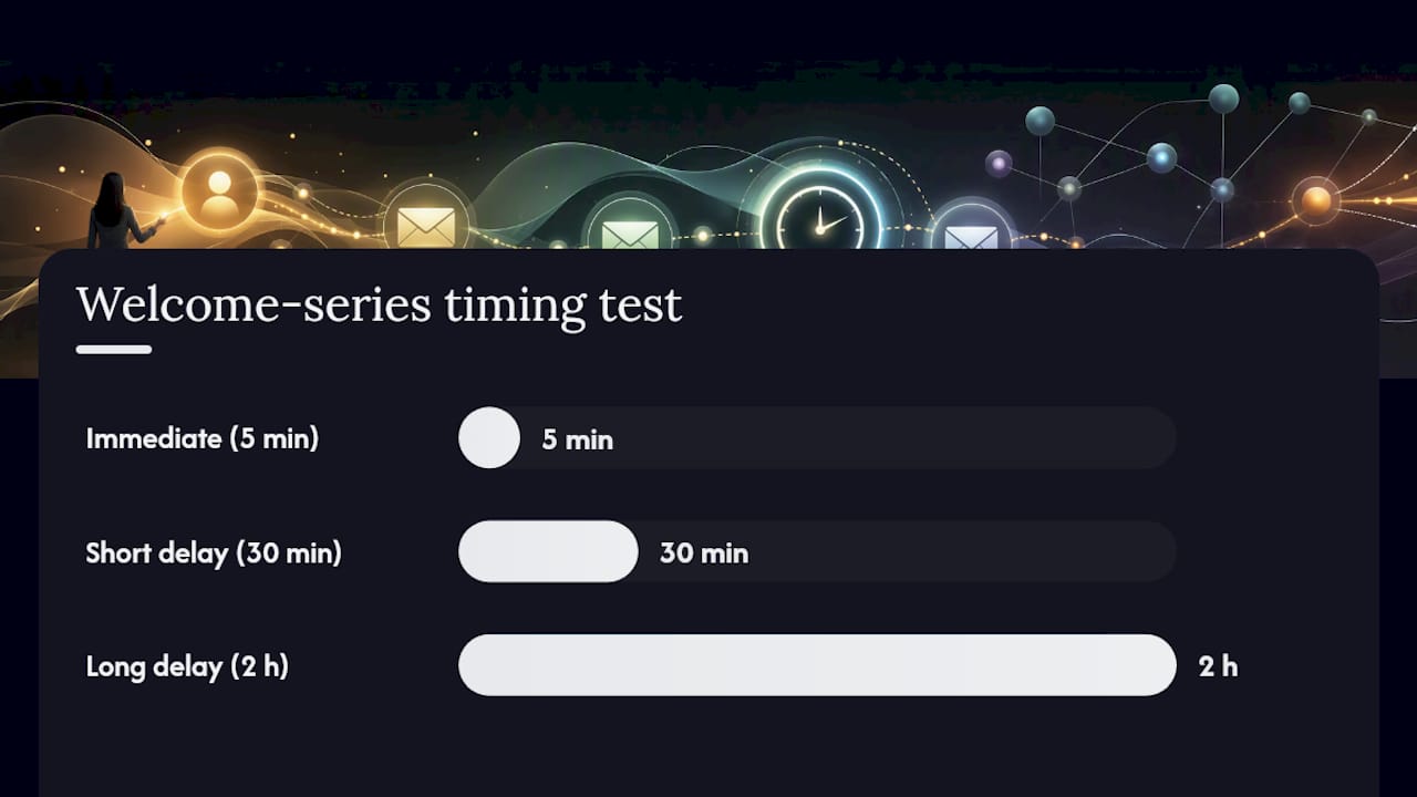
- Test send timing on your welcome series. The first email in a welcome series sent within 5 minutes of signup consistently outperforms one sent hours later. Test 5 minutes vs. 30 minutes vs. 2 hours.
- Run a subject-line framework test. Test three subject-line structures across a campaign: curiosity gap (“You left something behind”), direct benefit (“15% off, just for you”), and social proof (“1,200 people bought this last week”). One structure will win for your audience; use it as your default for 90 days.
- Gate your re-engagement flow. Before sending a re-engagement campaign to your full unengaged segment, test a smaller cohort with a hard-offer email (discount or free shipping). If they don’t click, suppress them. Sending to confirmed non-engagers hurts deliverability.
- Test preheader text as a second subject line. Most senders leave preheader as filler text. A preheader that adds urgency or a secondary benefit to the subject line is a free click-rate lever.
- Add a conditional split for VIP customers in your broadcast campaigns. VIP customers (top 20% by LTV) get early access or a higher-value offer. Everyone else gets the standard message. This lifts RPR for the VIP segment without discounting to your full list.
Pro Tip: When running A/B tests in Klaviyo, set your success metric to placed-order rate or RPR, not open rate. A subject line that wins on opens but loses on revenue is a net negative. Klaviyo’s built-in A/B testing lets you set revenue as the winning metric directly.
For a step-by-step email automation workflow that maps these tests to specific flow triggers, Swyftinteractive’s implementation guide covers the sequencing.
Methodology, dataset, and what these benchmarks can’t tell you
Klaviyo’s 2026 benchmark figures draw on data from 183,000+ brands across industries and revenue bands. The dataset is large enough to be statistically meaningful at the aggregate level, but several caveats apply before you use these numbers as hard targets.
- Attribution window: Klaviyo’s default is a 5-day last-touch attribution window for email. This means any purchase within 5 days of an email send is attributed to that email, even if the customer would have bought anyway. RPR and placed-order rate figures in the benchmark data reflect this window. Your account may use a different window, which changes comparability.
- Apple MPP distortion: Open rates across the dataset are inflated by MPP pre-fetching. Klaviyo and independent analysts both flag this. Use open rate for relative comparisons within your own account, not as an absolute benchmark against the dataset.
- Peer group selection: Klaviyo’s platform lets you select a comparable peer group by industry, revenue band, and list size for in-platform benchmarking. This produces a more accurate comparison than the all-brands aggregate.
- Incrementality vs. attribution: Platform-attributed revenue is not the same as incremental revenue. A holdout test (sending to 90% of a segment, suppressing 10%) is the only way to measure true email incrementality. The benchmarks don’t measure this.
A note on using these figures: The 2026 Klaviyo benchmarks are a directional tool, not a performance contract. A brand with a $300 AOV and a highly segmented list will naturally show different RPR figures than a $30 AOV brand with a broad list. Use the benchmarks to identify structural gaps (missing flows, low click rates) rather than to judge absolute performance. Attribution windows and MPP effects mean the numbers in your account and the numbers in the benchmark dataset may not be directly comparable without adjustment.
How Swyftinteractive applies these benchmarks to lift client revenue
The 2026 benchmarks are most useful when they drive a prioritized action plan, not just a diagnostic report. Here’s how a typical engagement at Swyftinteractive translates benchmark gaps into revenue.
Abandoned cart was live but untested. Welcome series had one email. Back-in-stock didn’t exist.
Results after 90 days:
- Flow revenue share moved from 18% to 38%
- Abandoned cart RPR increased after a 3-email sequence replaced the single-email version
- Back-in-stock flow launched and became the second-highest RPR flow in the account within 60 days
30/60/90 plan template
Days 1–30 (audit and quick wins):
- Pull current flow revenue share from Klaviyo’s revenue attribution report
- Audit abandoned cart, welcome, and back-in-stock flows for gaps (missing emails, no A/B tests, no segmentation)
- Launch or rebuild the weakest of the three
- Suppress non-openers beyond 90 days to clean deliverability
Days 31–60 (optimization):
- Run subject-line A/B tests on the top two flows
- Add product recommendation blocks to post-purchase flow
- Segment abandoned cart by cart value
- Set RPR and placed-order rate as primary KPIs in Klaviyo reporting
Days 61–90 (scale and test velocity):
- Launch browse abandonment flow
- Add VIP conditional split to broadcast campaigns
- Run re-engagement gating on unengaged segment
- Review flow revenue share against stage target; set next 90-day goal
Pro Tip: The single fastest win in most accounts is extending the abandoned cart sequence from one email to three. Email 1 sends within an hour (reminder), Email 2 at 24 hours (social proof or review), Email 3 at 72 hours (offer or urgency). Most brands see a meaningful RPR lift from this change alone, with no list growth required.
A Klaviyo lifecycle audit from Swyftinteractive delivers exactly this kind of prioritized roadmap, mapped to your account’s specific benchmark gaps.
The benchmark number most teams misread
Most teams look at their open rate first. It’s the most visible metric in Klaviyo’s dashboard, and it feels like a report card. But in 2026, open rate is the least reliable number in the dataset, and optimizing for it can actively mislead you.
The teams that use benchmarks well treat RPR as the primary diagnostic. If your flow RPR is below $1.00, you have a structural problem: missing flows, weak sequences, or poor segmentation. If your campaign RPR is above $0.20, you’re in the top tier of senders. Open rate tells you almost nothing about either.
The other common mistake: comparing your numbers to the all-brands average without adjusting for AOV or list size. A $200 AOV store with 50,000 subscribers should not be benchmarking against the same figures as a $30 AOV store with 500,000 subscribers. Klaviyo’s in-platform peer group tool exists precisely for this reason. Use it.
Swyftinteractive’s Klaviyo lifecycle audit and strategy
Knowing the benchmarks is one thing. Closing the gap between your current numbers and your stage target is another. Swyftinteractive’s Klaviyo lifecycle audit and strategy is built specifically for ecommerce brands that have the data but need a clear, prioritized plan to act on it.
The audit delivers:
- A full diagnostic of your current flow revenue share, RPR by flow type, and campaign performance against 2026 benchmarks
- A prioritized roadmap identifying which flows to build or fix first, based on your AOV, list size, and revenue stage
- A 30/60/90 implementation plan with specific A/B test hypotheses and success thresholds
- Recommendations for segmentation, product recommendations, and send cadence tied to your account’s own data
The target outcomes: higher RPR across core flows, increased flow revenue share toward your stage benchmark, and faster test velocity so you’re compounding improvements quarter over quarter. For brands ready to move from diagnosis to execution, the ecommerce growth strategy page outlines the full engagement model.
Sources
- Email Marketing Benchmarks 2026 – Klaviyo UK
- Email Automation vs Campaigns 2026 Revenue Data
- Klaviyo flow revenue benchmarks by brand stage | Eightx
FAQ
What is the average open rate for Klaviyo campaigns in 2026?
Note that Apple MPP inflates this figure for many senders, so treat it as a directional baseline rather than a precise engagement measure.
How much higher is flow RPR than campaign RPR in Klaviyo?
What flow revenue share should my store be targeting?
It depends on your revenue stage.
Which Klaviyo flows have the highest revenue per recipient?
Abandoned cart and back-in-stock flows consistently show the highest RPR. Abandoned cart averages approximately $3.65+ per recipient, with back-in-stock often higher, reflecting the near-certain purchase intent behind both triggers.
How do I benchmark my Klaviyo account against comparable brands?
Use Klaviyo’s built-in benchmarks report, which lets you select a peer group filtered by industry, revenue band, and list size. This produces a more accurate comparison than the all-brands aggregate average.