

Mobile-first design is no longer a best practice for U.S. ecommerce brands — it’s the baseline for staying competitive in 2026. If your store generates most of its traffic from phones but converts at half the rate of desktop, that gap is a design problem with a measurable dollar cost. Three moves close most of it fast:
- Measure your LCP and INP in Google Search Console or PageSpeed Insights — if LCP is above 2.5 seconds, you’re bleeding conversions.
- Enable wallet payments (Apple Pay, Google Pay, Shop Pay) at checkout before touching anything else.
- Cut your checkout form to the minimum required fields — every extra field costs you completions.
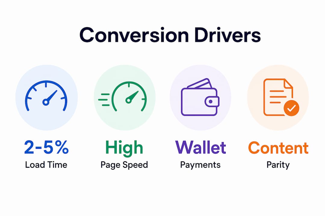
Saving one second of mobile load time typically lifts conversion rates by 2–5%, according to UX conversion experts. The rest of this guide shows you exactly where to focus and in what order.
Table of Contents
- Why does mobile-first design matter for ecommerce stores?
- Technical priorities that move the needle on mobile conversions
- Quick wins now versus signs you need a full redesign
- How do you measure the impact of mobile-first improvements?
- Practical implementation checklist for ecommerce teams
- Common misconceptions that hurt your mobile SEO and conversions
- What real mobile-first improvements look like in practice
- How to choose the right development partner for mobile-first work
- Key Takeaways
- The part most brand managers get wrong about mobile-first
- Swyftinteractive builds mobile-first stores that close the revenue gap
- Useful sources and further reading
- FAQ
Why does mobile-first design matter for ecommerce stores?
Mobile accounts for the majority of U.S. ecommerce traffic but a smaller share of revenue. That 22-point gap isn’t a demand problem. Shoppers are showing up on their phones — they’re just not finishing the purchase. The friction is in the design.

Understanding the importance of mobile-first design starts with a clear definition. Mobile-first design means you build the experience for a small screen first, then scale it up to desktop — not the reverse. That distinction matters more than it sounds. When you design for constraints first, you’re forced to decide what actually belongs on the page. The result is a leaner, faster, higher-converting experience on every device.
Google reinforces this with its mobile-first indexing policy: Googlebot evaluates your site using a smartphone user agent. Your mobile content is your ranking content. If your mobile page hides reviews, product descriptions, or schema behind JavaScript, Google may not see them at all.
Mobile users also behave differently from desktop shoppers. They’re often distracted, navigating with one thumb, and far less patient with friction. Anything over 2.5 seconds of load time on mobile tends to tank conversion rates. Hover-based interactions don’t exist. Menus need to be obvious. Variant selectors need to be tap-friendly. These aren’t minor UX tweaks — they’re the difference between a sale and a bounce.
Technical priorities that move the needle on mobile conversions
Not all fixes are equal. Here’s the order that produces the fastest ROI:
- Page speed and Core Web Vitals — LCP under 2.5s, INP under 200ms, CLS under 0.1. Stores consistently hitting these targets run conversion rates 35–45% higher than category averages. Start with Core Web Vitals before anything else.
- Checkout and form usability — Reduce fields to the minimum, use HTML5 input types so mobile keyboards auto-format (email, phone, number), and remove any step that doesn’t directly serve the transaction.
- Wallet-first payments — Apple Pay, Google Pay, and Shop Pay eliminate the form entirely for returning users. This is the single highest-ROI checkout change most stores can make in a day.
- Image optimization — Serve next-gen formats (WebP, AVIF), lazy-load below-the-fold images, and size images to the actual display dimensions. Oversized images are one of the most common LCP killers.
- Touch targets — Buttons and links need to be at least 44×44px. Small tap targets cause mis-taps, frustration, and exits.
- Content parity and schema — Every piece of content visible on desktop must be crawlable on mobile. Structured data (product schema, review schema) must render on the mobile version.
| Priority | Fix | Conversion Impact |
|---|---|---|
| Page speed | LCP/INP optimization | High — directly tied to 2–5% lift per second saved |
| Checkout friction | Fewer fields, wallet payments | High — immediate revenue recovery |
| Image optimization | WebP, lazy load, correct sizing | Medium-High — major LCP contributor |
| Touch targets | 44×44px minimum | Medium — reduces exit from mis-taps |
| Content parity | Crawlable mobile content | High — SEO ranking eligibility |
Pro Tip: Enable wallet payments before you plan a full redesign. It’s a one-day implementation that removes the biggest checkout barrier for mobile users — and it produces measurable results you can use to justify the larger project budget.
Quick wins now versus signs you need a full redesign
Most stores don’t need a full rebuild to see meaningful mobile gains. Start here:
Quick wins (days to two weeks):
- Enable Apple Pay, Google Pay, Shop Pay
- Remove non-required checkout fields
- Compress and convert images to WebP
- Add lazy loading to product and collection pages
- Increase button sizes to 44×44px minimum
- Add a sticky Add-to-Cart bar on product pages
Redesign triggers (weeks to months):
- Your mobile content doesn’t match desktop (content parity failure)
- LCP is above 4 seconds and image/script optimization alone won’t fix it
- Your checkout is a custom multi-step flow with heavy JavaScript rendering
- Navigation is a desktop dropdown adapted for mobile rather than built for it
- Variant selectors require hover or precise mouse interaction
The sequencing matters. Checkout optimization and wallet payments are often higher-ROI than full redesigns because they attack the highest-friction moment directly. Run the quick wins first, measure the lift over 30 days, then use that data to make the case for a larger investment if the numbers still show a gap.
How do you measure the impact of mobile-first improvements?
Track these metrics before and after any change:
- Mobile conversion rate (separate from desktop in GA4 or your analytics platform)
- LCP, INP, CLS via Google Search Console’s Core Web Vitals report
- Mobile cart abandonment rate
- Mobile revenue share as a percentage of total revenue
- Average order value on mobile vs. desktop
For A/B testing, always segment mobile traffic separately. Desktop and mobile users behave differently enough that blending them masks the signal. Run tests for at least two full weeks to account for weekly traffic patterns, and make sure your sample size is large enough before calling a winner.
A simple ROI estimate: for a typical store, a 2–5% conversion lift from one second of load-time improvement can quickly add up to thousands of dollars per year. Stack two or three speed improvements and the math gets compelling fast. Faster sites also tend to see measurable conversion gains beyond just load time, as the overall experience improves.
Practical implementation checklist for ecommerce teams
| Task | Owner | Priority | Est. Time |
|---|---|---|---|
| Audit LCP and INP in Search Console | Dev or agency | Critical | 2 hours |
| Enable wallet payments (Apple Pay, Google Pay) | Dev | Critical | 1 day |
| Compress and convert images to WebP | Dev or designer | High | 2–4 hours |
| Add lazy loading to collection/product pages | Dev | High | 2–4 hours |
| Simplify checkout form fields | Dev + UX | High | 1–2 days |
| QA on mid-range Android at 4G speeds | QA or dev | High | Half day |
| Verify content parity (mobile vs. desktop) | Dev + SEO | Critical | 1 day |
| Check touch target sizes (44×44px min) | Designer | Medium | 2 hours |
| Validate product and review schema on mobile | Dev + SEO | High | 2–4 hours |
Pro Tip: Test on a mid-range Android device — a Pixel 6a or similar — on a throttled 4G connection, not your office Wi-Fi. Flagship device testing misses the majority of real-world mobile UX failures your customers actually experience.
Run weekly checks on Core Web Vitals after any deployment. Do a full mobile UX audit quarterly — device ecosystems and browser behavior shift enough that a passing score in January can degrade by April.
Common misconceptions that hurt your mobile SEO and conversions
Myth: Responsive design equals mobile-first design.
It doesn’t. Responsive design typically shrinks a desktop layout to fit a smaller screen. Mobile-first means you design the single-column, thumb-navigable experience first and add complexity for larger screens. The output can look similar, but the underlying hierarchy and performance are fundamentally different.
Pitfall: Hiding content behind JavaScript or collapsed tabs.
If your product descriptions, reviews, or size guides only appear after a JavaScript interaction, Google’s mobile crawler may not index them. This is a direct ranking risk.
Google’s mobile-first indexing uses a smartphone Googlebot to evaluate your pages. Content that requires JavaScript execution or user interaction to appear — collapsed tabs, accordion sections, lazy-loaded reviews — may be invisible to the crawler. If that content includes keywords, schema, or trust signals, you’re ranking without your best assets. Use a single responsive URL with all content crawlable in the initial HTML load.
Other common errors:
- Hover-dependent interactions (menus, tooltips, swatches) that don’t work on touch screens
- Intrusive interstitials that trigger on mobile and violate Google’s mobile usability guidelines
- Images sized for desktop served to mobile (massive file sizes, slow LCP)
What real mobile-first improvements look like in practice
The following anonymized outcomes come from ecommerce projects focused on mobile-first improvements.
| Store Type | Change Made | Before | After |
|---|---|---|---|
| Apparel DTC | Wallet payments + checkout simplification | — | — |
| Home goods | LCP optimization (images + server response) | LCP above 4 seconds | LCP under 2.5 seconds |
| Beauty brand | PDP reorder + sticky Add-to-Cart | — | — |
| Accessories | Content parity fix + schema restoration | Page 3 ranking | Page 1 ranking (top 5) |
What drove the results in each case:
- Wallet payments removed the form entirely for users with saved credentials — the biggest single checkout friction point on mobile.
- LCP improvements came primarily from image format conversion and removing render-blocking scripts, not full rebuilds.
- PDP reorders put the Add-to-Cart button above the fold on mobile, where users could act without scrolling.
- Content parity fixes restored product descriptions and review schema that had been hidden behind JavaScript tabs.
How to choose the right development partner for mobile-first work
When to use internal devs vs. an external agency:
- Internal devs work well for quick wins — image compression, lazy loading, wallet payment setup — if they have Shopify or your platform experience.
- A specialist agency makes sense when you need a full mobile-first rebuild, Core Web Vitals remediation across a large catalog, or integrated checkout and email automation work.
- A freelance contractor can handle scoped technical tasks (schema markup, speed audits) but typically lacks the full-funnel view needed for a redesign.
Questions to ask any agency before signing:
- Can you show before/after Core Web Vitals data from a comparable ecommerce client?
- How do you handle content parity during a redesign?
- Do you run A/B tests on mobile separately from desktop?
- What’s your process for testing on mid-range Android devices?
- Do you have experience integrating Klaviyo flows with mobile checkout events?
Red flags:
- No mobile-specific audit in their discovery process
- Vague metrics (“improved performance,” “better UX”) with no numbers
- No A/B testing history or methodology
- Case studies that only show desktop screenshots
Key Takeaways
Mobile-first design requires fixing page speed, checkout friction, and content parity in that order — quick wins on wallet payments and image optimization typically deliver faster ROI than a full redesign.
| Point | Details |
|---|---|
| Speed is the top lever | Each second of mobile load time saved typically lifts conversions by 2–5%. |
| Wallet payments first | Enabling Apple Pay and Google Pay is a one-day fix that removes the biggest checkout barrier. |
| Content parity protects rankings | Hidden JS content can make reviews and descriptions invisible to Google’s mobile crawler. |
| Quick wins before redesign | Test checkout and speed fixes first; use the data to justify a larger project if gaps remain. |
| Swyftinteractive for full-funnel work | Swyftinteractive builds mobile-first ecommerce sites and integrates Klaviyo automation for brands ready to close the traffic-to-revenue gap. |
The part most brand managers get wrong about mobile-first
The conversation about mobile-first design almost always starts with traffic numbers and ends with a redesign proposal. What gets skipped is the middle: the specific, fixable moments where mobile users are deciding to leave.
Wallet payments are the clearest example. Most stores know their mobile checkout converts worse than desktop. Very few have actually looked at where in the checkout flow the drop happens. When you look, it’s almost always the payment form — specifically, the moment a user on a phone is asked to type a 16-digit card number. Enabling Shop Pay or Apple Pay doesn’t require a redesign. It requires an afternoon.
The same logic applies to content parity. Brands spend months planning a mobile redesign while their existing product pages are already ranking below their potential because review schema is hidden behind a JavaScript accordion. Fix the accordion first. The redesign can wait.
Mobile-first design is genuinely worth doing as a full project when the underlying architecture is wrong. But most stores have $50K–$100K worth of recoverable revenue sitting in fixes that take days, not months. Start there, measure it, and let the data tell you what comes next.
Swyftinteractive builds mobile-first stores that close the revenue gap
If your store’s mobile traffic is strong but your mobile revenue share is lagging, the fix is usually a combination of site architecture, checkout optimization, and post-purchase automation working together. Swyftinteractive specializes in exactly that: mobile-first ecommerce builds on Shopify, checkout and page speed optimization, and Klaviyo automation that recovers abandoned carts and drives repeat purchases.
The starting point is an audit. Swyftinteractive’s ecommerce website checklist covers mobile performance, checkout friction, and Klaviyo automation gaps in one pass — so you know exactly what to fix and in what order. If you’re ready to close the gap between your mobile traffic and your mobile revenue, get in touch to start with a site review.
Useful sources and further reading
- Google: Mobile-First Indexing Best Practices — Shopify’s breakdown of Google’s mobile-first indexing requirements, including content parity and structured data guidance.
- Core Web Vitals and Conversion Benchmarks — 2026 benchmark data linking LCP/INP targets to conversion rate uplifts.
- Mobile Revenue Share by Ecommerce Vertical — U.S. mobile traffic vs. revenue data by category (apparel, electronics, retail average).
- UX Conversion Research: Load Time and Conversion Lift — The 2–5% conversion lift per second of load time saved, with UX context.
- Mobile-First Indexing Strategies for Ecommerce — Technical guidance on responsive single-URL architecture and indexing best practices.
Run a PageSpeed Insights audit on your top five mobile landing pages today. The data will tell you exactly where to start.
FAQ
What does mobile-first design mean for an ecommerce store?
Mobile-first design means building the store experience for small screens first, then scaling up to desktop — not shrinking a desktop layout down. It forces content prioritization and produces faster, higher-converting experiences on every device.
How much can mobile-first improvements lift conversion rates?
Saving one second of mobile load time typically produces a 2–5% conversion lift, according to UX conversion research. Stores hitting Core Web Vitals targets consistently run conversion rates 35–45% above category averages.
Does responsive design count as mobile-first?
No. Responsive design adapts a layout to screen size; mobile-first design starts with the mobile experience and adds complexity for larger screens. The difference shows up in page hierarchy, performance, and how Google indexes your content.
What’s the fastest mobile fix for most ecommerce stores?
Enabling wallet payments (Apple Pay, Google Pay, Shop Pay) is typically the highest-ROI single change — it removes the payment form entirely for users with saved credentials and can be implemented in a day.
How does Swyftinteractive approach mobile-first ecommerce builds?
Swyftinteractive builds mobile-first Shopify stores with checkout optimization, Core Web Vitals remediation, and Klaviyo automation integrated from the start — so the site and the post-purchase flows work together to close the traffic-to-revenue gap.