

TL;DR:
- Website design and user experience critically influence conversion rates in eCommerce.
- Mobile optimization and clear product display are vital for increasing online sales.
- Combining website improvements with email automation significantly boosts revenue and customer retention.
Most eCommerce store owners believe a great product is enough to generate consistent online sales. It is not. The real bottleneck is almost always the website itself. Conversion rates average 2.35 to 3.0%, meaning the majority of your visitors leave without buying. Top-performing stores hit 6 to 12%, not because they sell better products, but because they have engineered every page, flow, and touchpoint to reduce friction and build trust. This guide breaks down exactly how website design and email marketing strategies influence those numbers, and what you can do to move your store from average to exceptional.
Table of Contents
- Why design matters for online sales
- Key website elements that drive conversions
- The impact of email marketing and automation in design
- Testing, iteration, and mobile optimization
- Our take: why most eCommerce sites underperform
- Grow sales through expert design and marketing automation
- Frequently asked questions
Key Takeaways
| Point | Details |
|---|---|
| Design directly impacts sales | Small design changes can significantly affect conversion rates and revenue. |
| Mobile optimization is essential | Mobile-focused design boosts conversions and keeps pace with shifting buyer behavior. |
| Testing drives higher results | Continuous website and email optimization can increase sales up to 2.4 times. |
| Automation multiplies conversion | Email marketing automation bridges design and customer action, increasing repeat sales. |
Why design matters for online sales
Design is not decoration. For an eCommerce store, it is the sales floor, the lighting, the signage, and the checkout counter all rolled into one. When a visitor lands on your site, they form a judgment within seconds. That judgment determines whether they stay, browse, and buy, or bounce and never return.
The role of design in eCommerce goes far deeper than color palettes and font choices. It shapes credibility. A poorly structured layout signals risk to a shopper. A clean, logical flow signals professionalism and safety. Shoppers do not consciously think about this. They just feel it, and they act on that feeling.
Here is what the data tells us about the gap between average and elite:
- Mobile converts at roughly 2.1%, while desktop sits closer to 4.3%
- Top eCommerce performers achieve conversion rates of 6 to 12%
- Poor navigation is one of the most cited reasons shoppers abandon a site
- Visual hierarchy, meaning how your eye moves through a page, directly affects whether a visitor reaches the add-to-cart button
Think about visual hierarchy for a moment. If your product images are small, your price is buried, and your call-to-action button blends into the background, you are making the customer work too hard. Shoppers are not patient. They will not hunt for the buy button.
“Your website is not just a digital storefront. It is your most powerful salesperson, working around the clock. If the design confuses, it costs you.”
Mobile deserves special attention here. The gap between mobile and desktop conversion rates is not just a technology problem. It is a design problem. Buttons too small to tap, text that requires zooming, and checkout forms that feel clunky on a small screen all erode confidence. Fixing these issues is not optional anymore. Conversion rate optimization for mobile is one of the highest-leverage investments a store can make in 2026.
Product display also plays a massive role. High-quality images from multiple angles, zoom functionality, and lifestyle shots that show the product in context all reduce the uncertainty that stops people from buying online. Shoppers cannot touch your product. Your design has to compensate for that.
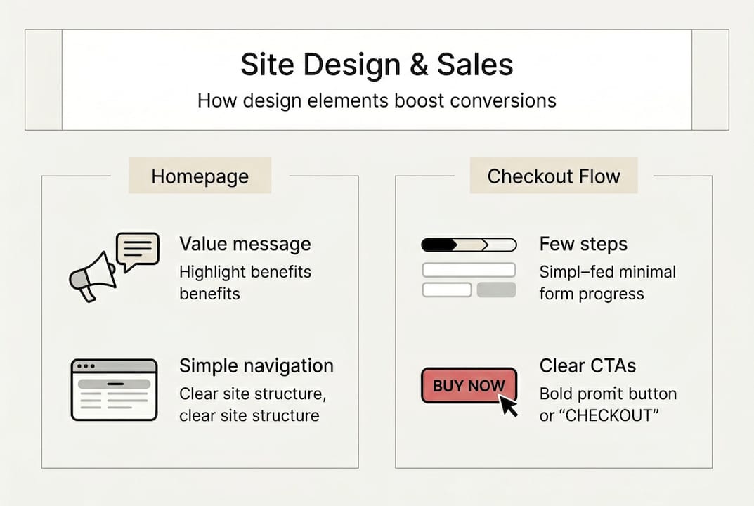
Key website elements that drive conversions
Knowing that design matters is one thing. Knowing which specific elements to fix is another. Let us get practical.
Your homepage needs a clear value proposition above the fold, meaning visible without scrolling. Navigation should be simple, with no more than five to seven top-level categories. Every extra click between a visitor and a product is a chance to lose them.
One of the most debated topics in eCommerce design right now is minimalism versus a busier, content-rich layout. The answer is not as simple as most people think. Busy designs sometimes outperform minimalism when a store needs to display many options or communicate high value through social proof, badges, and product details.
| Design style | Best for | Risk |
|---|---|---|
| Minimalist | Luxury, single-product brands | May feel sparse, hide value |
| Content-rich | Multi-product, value-focused brands | Can overwhelm if poorly structured |
| Hybrid | Most eCommerce stores | Requires strong visual hierarchy |
For product pages, follow this sequence:
- Lead with high-quality images (minimum three angles)
- Place the product name and price immediately visible
- Use a short, benefit-focused description above the fold
- Make the add-to-cart button impossible to miss
- Include social proof, reviews, or trust badges near the CTA
Checkout flow is where many stores bleed revenue. Every unnecessary field, every forced account creation, and every surprise shipping cost at the final step kills conversions. Streamline it ruthlessly.

Pro Tip: A/B test your CTA button color and copy. Something as simple as changing “Add to cart” to “Get yours now” or switching from gray to a high-contrast color can lift conversions measurably. Small changes compound over thousands of visitors.
Do not overlook live chat and chatbots either. Chatbots boost conversion rates by answering objections in real time, keeping visitors engaged when they would otherwise leave. For tips on optimizing eCommerce website conversions at every stage, the details matter enormously. And if you want a broader set of conversion rate tips backed by real store data, the fundamentals above are just the starting point.
The impact of email marketing and automation in design
A well-designed website captures attention. Email automation converts that attention into revenue over time. These two systems are not separate strategies. They are one engine.
When a visitor browses your store but does not buy, what happens next? Without email capture and automation, the answer is nothing. They are gone. With a well-placed pop-up, an exit-intent trigger, or a post-browse sequence, you have a second chance, and a third, and a fourth.
Here is how design and email work together:
- Pop-up forms embedded in the site capture leads at peak intent moments
- Cart abandonment emails recover revenue that would otherwise be lost
- Welcome sequences introduce new subscribers to your brand and top products
- Browse abandonment flows re-engage visitors who showed interest but did not convert
- Post-purchase sequences build loyalty and drive repeat orders
The numbers behind this are compelling. Continuous testing lifts conversion rates 2.4x, and the brands that achieve this combine site optimization with automated follow-up sequences that keep the conversation going after a visitor leaves.
| Automation type | Primary goal | Typical impact |
|---|---|---|
| Cart abandonment | Recover lost sales | 5 to 15% recovery rate |
| Welcome series | Brand introduction | Higher LTV, early purchases |
| Browse abandonment | Re-engage interest | Increased return visits |
| Post-purchase flow | Retention and upsell | Repeat order rate increase |
| Win-back campaign | Reactivate dormant buyers | 10 to 20% reactivation |
The design of your email capture forms matters just as much as the emails themselves. A poorly placed, generic pop-up gets ignored or dismissed. A well-timed, value-driven offer, like a discount or a free resource, placed at the right moment in the browsing journey, converts visitors into subscribers who are primed to buy.
For a full breakdown of how to build these systems, the email marketing automation guide covers the entire setup. Understanding the email automation benefits for eCommerce stores makes it clear why this is not optional for serious growth.
Testing, iteration, and mobile optimization
No design is perfect on launch day. The stores that consistently outperform their competitors are the ones that treat their website as a living system, not a finished product.
Mobile optimization is the most urgent priority for most stores right now. With more than half of eCommerce traffic coming from mobile devices, a desktop-first design is a revenue leak. Faster websites directly boost conversions, and on mobile, speed is everything. A one-second delay in load time can reduce conversions significantly.
Here are the tools and practices that make the biggest difference:
- Google PageSpeed Insights: Identifies speed and performance issues on both mobile and desktop
- Hotjar or Microsoft Clarity: Records user sessions and heatmaps to show where visitors drop off
- Google Optimize or VWO: Runs A/B tests on headlines, layouts, and CTAs
- Klaviyo analytics: Tracks email-driven revenue and flow performance
- Shopify Analytics: Monitors funnel drop-off and product performance
Split testing, also called A/B testing, means showing two versions of a page or element to different visitors and measuring which performs better. It removes guesswork. Instead of debating whether a headline should say “Shop now” or “See the collection,” you test it and let the data decide.
Pro Tip: Start mobile optimization with the three highest-impact fixes first: page load speed, button size and placement, and checkout form simplicity. These three alone can move your mobile conversion rate meaningfully before you tackle anything else.
Cart abandonment is one of the clearest signals that something in your design or flow is broken. Reducing cart abandonment requires both design fixes, like a simplified checkout, and marketing fixes, like timely recovery emails. Use the eCommerce marketing checklist to audit your current setup and identify the gaps.
Our take: why most eCommerce sites underperform
Here is something most agencies will not tell you: the majority of eCommerce stores underperform not because of bad products or weak marketing budgets, but because of design decisions made years ago that nobody has revisited.
The conventional wisdom says make it look beautiful. Hire a designer, pick a premium theme, and the sales will follow. That is only partially true. Beauty without function is expensive wallpaper. We have seen stores with stunning visuals convert at 1% because the navigation was confusing and the mobile experience was an afterthought.
The other trap is chasing minimalism because it looks sophisticated. Sometimes it works brilliantly. But for stores with large catalogs or value-driven audiences, stripping away information removes the very signals that build buyer confidence. Optimizing eCommerce websites for revenue means understanding your specific customer, not copying a design trend.
The real secret is iteration. The brands hitting 8 to 12% conversion rates did not get there with one great design. They tested, measured, adjusted, and tested again. That mindset, not any single design choice, is what separates the top performers from everyone else.
Grow sales through expert design and marketing automation
If this article has made one thing clear, it is that design and marketing automation are not separate projects. They are two halves of the same revenue engine. Getting both right requires strategy, technical skill, and ongoing optimization.
At Swyft Interactive, we build eCommerce websites designed to convert and pair them with Klaviyo-powered automation that keeps revenue flowing after every visit. Whether you are starting from scratch or optimizing an existing store, our team delivers measurable results. Start with our eCommerce website checklist to see where your store stands, explore the email marketing automation guide for your next steps, or connect with our Klaviyo email marketing agency team directly to build a system that scales.
Frequently asked questions
What is the average eCommerce conversion rate in 2026?
Current rates average 2.35 to 3.0%, with top-performing stores reaching 6 to 12% through consistent design and marketing optimization.
How does mobile site design affect online sales?
Mobile converts at roughly 2.1% compared to 4.3% on desktop, making mobile speed and UX improvements among the highest-return investments for any eCommerce store.
Is minimalism always best for eCommerce websites?
No. Busy designs outperform minimalism in many cases, particularly for stores with large product catalogs or audiences that rely on detailed information to make purchase decisions.
How can email automation improve website sales?
Email automation captures visitors who leave without buying and brings them back through cart recovery, browse abandonment, and post-purchase sequences, directly increasing conversion rates and customer lifetime value.