

TL;DR:
- Responsive design automatically adjusts website layouts, images, and content across all screen sizes using fluid grids and CSS media queries. It simplifies maintenance, enhances SEO, and improves user experience by providing consistent, accessible layouts on any device. Most teams fail to prioritize mobile-first development, but modern CSS tools make proper implementation more straightforward.
Responsive design is defined as a web development approach where a site’s layout, images, and content automatically adjust to fit any screen size, from smartwatches to ultrawide monitors. The standard industry term is “responsive web design,” coined by Ethan Marcotte in 2010, and it remains the dominant paradigm for building websites in 2026. Three core techniques power it: fluid grids, flexible images, and CSS media queries. Google’s mobile-first indexing makes responsive web design a direct SEO factor, not just a UX preference. For web designers, developers, and digital marketers, understanding this approach is the foundation of every high-performing site built today.
What is responsive design and how does it actually work?
Responsive web design works by using relative units and conditional CSS rules to reformat a page based on the available screen space. Instead of building separate sites for mobile and desktop, you write one codebase that serves every device. The browser reads the screen dimensions, applies the matching CSS rules, and renders the layout accordingly.
The three foundational techniques are:
- Fluid grids: Columns and containers use percentage-based widths instead of fixed pixels. A sidebar set to 30% stays proportional whether the viewport is 400px or 2,000px wide. Avoid fixed pixel widths for layout elements and use relative units like percentages or viewport widths to prevent horizontal scrolling on small screens.
- Flexible images: Images scale within their containers using
max-width: 100%. This prevents images from overflowing their parent elements on narrow screens. - CSS media queries: These conditional rules apply different styles at specific breakpoints. A three-column grid on desktop collapses to a single column on mobile using a
@media (max-width: 768px)rule.
Modern CSS has added two more tools that every developer should know. The CSS clamp() function creates fluid typography that scales smoothly between a minimum and maximum size without requiring multiple media queries. A heading set with clamp(1.5rem, 4vw, 3rem) stays readable at every viewport width automatically.
Container queries are the other major advancement. Container queries allow components to respond to their parent container’s size rather than the viewport, enabling truly reusable adaptive components without extra JavaScript. Browser support crossed 95% in 2023, making container queries production-ready for most projects. That matters because a card component inside a narrow sidebar needs different styling than the same card in a wide main column. Media queries cannot solve that cleanly. Container queries can.

Pro Tip: Choose breakpoints based on content, not device sizes. Resize your browser slowly and add a breakpoint wherever the layout starts to look broken. This approach future-proofs your design against new device sizes that do not match today’s common screen dimensions.
The mobile-first approach
Mobile-first design writes base CSS for small screens first, then progressively enhances the layout for larger viewports using min-width media queries. The practical benefit is a smaller CSS payload delivered to mobile users, which directly improves load times on slower connections. Google’s mobile-first indexing crawls and ranks the mobile version of your site. Writing mobile-first CSS aligns your development workflow with how Google evaluates your pages.
Responsive design vs adaptive design: what is the real difference?
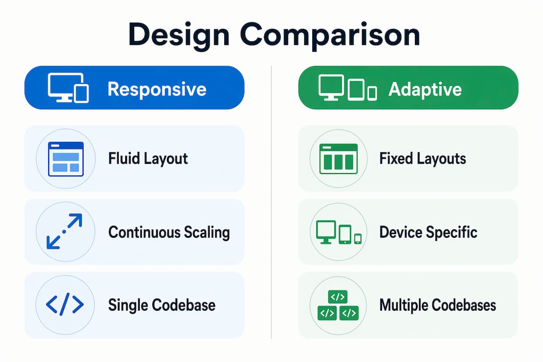
Responsive design scales continuously across all screen sizes using one fluid codebase. Adaptive design serves fixed layouts built for specific device widths, typically switching between a small, medium, and large template. Both approaches solve the multi-device problem, but they do it differently.
| Feature | Responsive design | Adaptive design |
|---|---|---|
| Layout scaling | Continuous and fluid | Fixed at set breakpoints |
| Codebase | Single codebase | Multiple templates |
| URL structure | One canonical URL | Often separate URLs |
| SEO maintenance | Simpler | More complex |
| Future device support | Automatic | Requires new templates |
| Maintenance effort | Lower | Higher |
Responsive design is preferred for most content-driven websites because it supports continuous scaling across unknown future screen sizes, requires one codebase and URL, and reduces maintenance overhead. A single canonical URL also simplifies SEO because all backlinks point to one address rather than splitting authority across device-specific URLs.
Adaptive design still makes sense in specific situations. High-traffic applications with very different mobile and desktop user goals, such as a banking app where mobile users primarily check balances and desktop users manage complex transactions, can benefit from purpose-built templates for each context.
Pro Tip: The most common misconception is that responsive design means “mobile version exists.” A truly responsive site has no separate mobile version. It is one site that reflows intelligently. If you are maintaining a separate m-dot subdomain alongside your main site, you are running adaptive design, not responsive design, regardless of what your brief says.
How to implement responsive design effectively
A structured workflow prevents the most common implementation mistakes. Follow these steps to build a responsive site that holds up across devices and passes performance audits.
-
Wireframe for mobile first. Sketch the mobile layout before touching the desktop. This forces you to prioritize content hierarchy. Every element on the mobile wireframe must earn its place because screen space is limited.
-
Define content-driven breakpoints. Open your wireframe in a browser and resize the window. Note where the layout breaks visually. Those points become your breakpoints. Do not copy a list of device widths from a style guide.
-
Write mobile-first CSS. Start with base styles that work on small screens. Use
min-widthmedia queries to layer in enhancements for larger viewports. This keeps your mobile CSS lean and avoids the override complexity that comes from writing desktop-first styles. -
Use container queries for components. Any UI component that appears in multiple layout contexts, such as product cards, testimonial blocks, or navigation menus, should use container queries instead of media queries. Container queries enable reusable components that adapt to their parent container without extra JavaScript.
-
Apply fluid typography with CSS clamp(). Replace static font sizes with
clamp()values. This eliminates a category of media queries entirely and keeps text readable at every viewport width. -
Test on real devices. Testing on physical iOS and Android devices catches issues that emulators miss, including touch target accuracy, keyboard behavior, and real-world rendering performance. Use Google PageSpeed Insights to audit Core Web Vitals on mobile after each major build phase.
-
Enforce accessibility from the start. Combine responsive design with semantic HTML and ARIA roles to create inclusive experiences. Touch targets should be at least 44×44 pixels. Logical content reflow benefits users who rely on screen readers and keyboard navigation.
Pro Tip: Modern CSS features like Flexbox, Grid, and Container Queries reduce the complexity of responsive design by making components inherently flexible. If you find yourself writing more than two or three media queries for a single component, the component’s structure probably needs rethinking, not more breakpoints.
What are the benefits of responsive design for UX, SEO, and ecommerce?
The benefits of responsive design extend well beyond layout. They affect search rankings, conversion rates, and long-term customer retention.
- Consistent user experience: A single fluid layout delivers the same content hierarchy and brand experience on every device. Users who switch from mobile to desktop do not encounter a different site structure, which builds trust and reduces confusion.
- Accessibility for all users: Responsive design scales text and images automatically, improves navigation with larger touch targets, and enables logical content reflow that benefits users with visual or motor disabilities.
- SEO through mobile-first indexing: Google indexes the mobile version of your site first. A responsive site with one canonical URL concentrates all link equity in one place. Separate mobile URLs split that authority and complicate crawl budgets. Pairing a responsive site with a strong ecommerce SEO strategy compounds the ranking benefits.
- Lower bounce rates: Mobile-first performance optimization reduces page payload and improves Core Web Vitals scores. Faster pages keep users on site longer. Ignoring mobile-first leads to higher bounce rates even when the desktop experience looks polished.
- Ecommerce retention and revenue: A consistent, fast layout across devices directly supports ecommerce UX and growth. Shoppers who encounter layout breaks or slow load times on mobile abandon carts at higher rates. Responsive design removes that friction. Research on customer retention strategies consistently shows that experience quality on mobile is a primary driver of repeat purchases.
The business case is direct: a responsive site is faster, more accessible, easier to maintain, and better ranked than a non-responsive alternative. For ecommerce brands, those factors translate to measurable revenue differences.
Key Takeaways
Responsive design is the single most impactful technical decision you make for a website’s performance, accessibility, and search visibility across every device.
| Point | Details |
|---|---|
| Core definition | Responsive design uses fluid grids, flexible images, and CSS media queries to adapt layouts to any screen size. |
| Mobile-first is non-negotiable | Writing CSS for mobile first reduces payload, improves Core Web Vitals, and aligns with Google’s indexing approach. |
| Container queries change components | Use container queries for reusable UI components that appear in multiple layout contexts across a site. |
| Responsive beats adaptive for most sites | One codebase, one URL, and continuous scaling make responsive design easier to maintain and better for SEO. |
| Accessibility is built in | Semantic HTML, ARIA roles, and minimum 44x44px touch targets make responsive sites inclusive by default. |
Why I think most teams still get responsive design wrong
After working across dozens of web projects, the pattern I see most often is teams treating responsive design as a final checklist item rather than a foundational constraint. The mobile layout gets added at the end, after the desktop design is locked. That sequence produces exactly the kind of site that looks fine on a 1440px monitor and breaks on a $200 Android phone.
The shift that actually works is treating mobile as the primary experience. Not a fallback. Not a simplified version. The primary one. When you wireframe mobile first, every subsequent decision about content, hierarchy, and interaction gets made with the hardest constraint in mind. Desktop becomes the enhancement, and it is almost always easier to add complexity than to remove it.
The other thing I have noticed is how much modern CSS has reduced the excuse for poor responsive implementation. Flexbox and Grid handle the majority of layout challenges without a single media query. Container queries solve the component-context problem that used to require JavaScript workarounds. CSS clamp() eliminates entire categories of typography breakpoints. The tools are genuinely better now. The gap between a well-implemented responsive site and a poorly implemented one is almost always a workflow problem, not a technology problem.
Test on real hardware. An emulator will not show you that a tap target is too small for a human thumb, or that a font renders differently on a mid-range Android device. Physical device testing is not optional for production-quality work. It is the step that separates sites that feel right from sites that technically pass a checklist.
— Leon
How Swyftinteractive builds responsive ecommerce sites that convert
Responsive design is the foundation, but it only drives revenue when it is paired with the right growth infrastructure. Swyftinteractive builds high-converting ecommerce websites that combine mobile-first responsive layouts with full-funnel marketing systems, including Klaviyo email automation, post-purchase flows, and performance analytics. Every site Swyftinteractive delivers is built to load fast, convert across devices, and retain customers through integrated marketing. If you want a responsive ecommerce site that does more than look good on mobile, the ecommerce website optimization checklist is the right place to start.
FAQ
What is responsive web design in simple terms?
Responsive web design is a method of building websites so the layout automatically adjusts to fit any screen size. It uses fluid grids, flexible images, and CSS media queries to reformat content without creating separate sites for different devices.
How does responsive design differ from a mobile-friendly site?
A mobile-friendly site may simply shrink content to fit a small screen. A responsive site actively reflows and restructures its layout, typography, and images to provide an experience designed for each screen size.
What are the main principles of responsive design?
The three core principles are fluid grids, flexible images, and CSS media queries. Modern practice adds mobile-first CSS writing, fluid typography with CSS clamp(), and container queries for component-level adaptability.
Does responsive design affect SEO?
Yes. Google uses mobile-first indexing, meaning it ranks sites based on their mobile version. A responsive site with one canonical URL concentrates link equity and simplifies crawling, which supports higher search rankings compared to separate mobile URLs.
When should you use adaptive design instead of responsive design?
Adaptive design works best when mobile and desktop users have fundamentally different goals and workflows, such as complex enterprise applications. For content-driven sites and ecommerce stores, responsive design is the better choice because it requires less maintenance and scales automatically to new device sizes.