

TL;DR:
- Mobile optimization is essential for ecommerce success, as most traffic comes from mobile devices, but conversion rates remain low.
- Focusing on fast load times, easy checkout, and mobile-friendly design significantly improves conversions and search rankings.
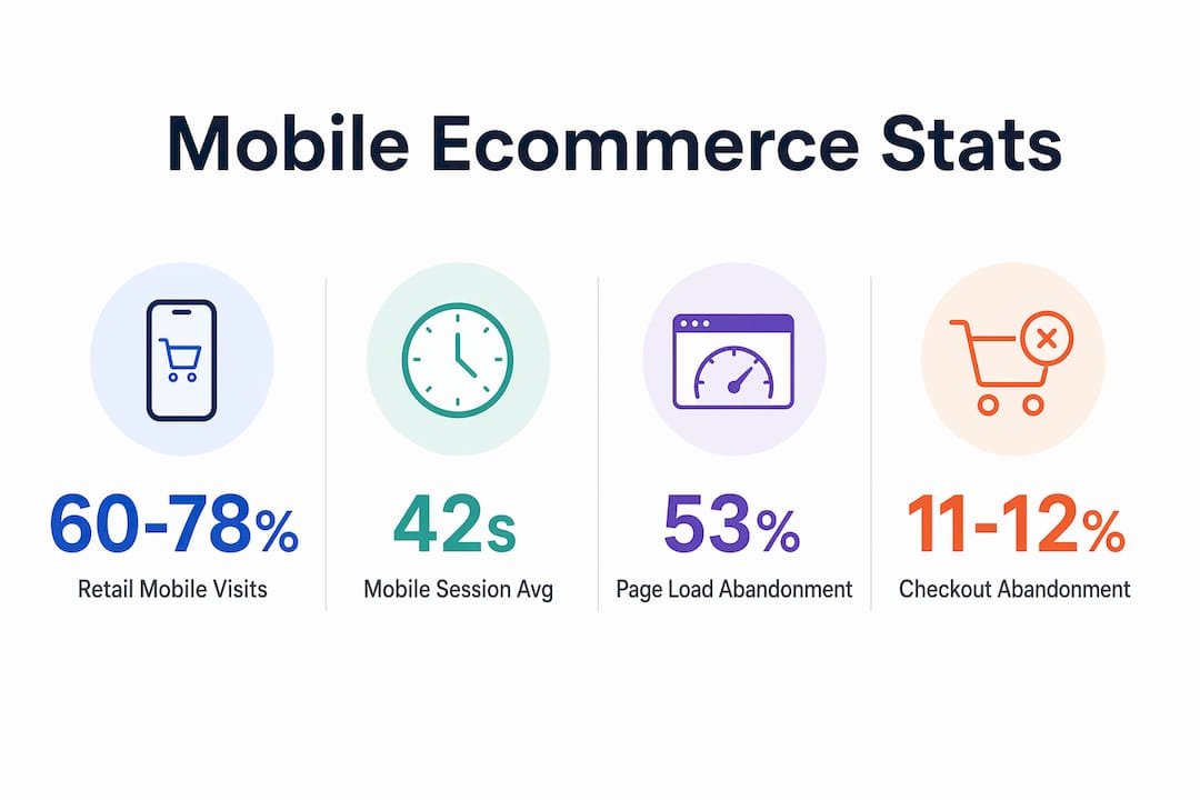
Mobile optimization is the practice of tailoring websites and digital content to perform at full capacity on smartphones and tablets, delivering fast load times, clear navigation, and frictionless checkout. Mobile traffic accounts for 60–78% of all online retail visits in 2026, yet mobile conversion rates run 1.5× to 2× lower than desktop. That gap is not a technical curiosity. It is direct, measurable revenue left on the table every single day. Understanding why mobile optimization matters means understanding where your customers actually shop and why they leave before buying.
Why mobile optimization matters for conversion rates
Mobile shoppers behave differently from desktop shoppers, and most ecommerce sites are built for the wrong audience. Mobile users operate in “survival mode,” scanning fast, deciding in seconds, and abandoning anything that slows them down. Desktop users research deliberately, comparing options across tabs and reading product details. Mobile users want price, image, and a buy button. That behavioral gap demands a completely different design approach.

The numbers make the cost of ignoring this clear. Mobile sessions average 42 seconds compared to over two minutes on desktop. You have less than a minute to load the page, communicate value, and move a shopper toward checkout. Sites that fail to do this see mobile cart abandonment rates of 76–81%, compared to 63–69% on desktop. That 12-point gap represents customers who reached your checkout and still left.
The benefits of mobile-friendly sites show up directly in conversion data. Optimized mobile stores achieve conversion rates of 2.5–3.3%, while unoptimized sites sit at 0.5–1.5%. That difference compounds across thousands of monthly visitors. A store receiving 50,000 mobile visits per month at 0.8% conversion earns far less than the same store at 2.8% conversion, with no change in ad spend.
Key UX factors that drive mobile conversions include:
- Page load time. Shoppers expect pages to load in under three seconds. Every additional second increases abandonment.
- One-tap payments. Apple Pay and Google Pay remove the friction of manual card entry, which is the single biggest drop-off point on mobile checkout forms.
- Thumb-friendly navigation. Menus, buttons, and CTAs must be large enough to tap accurately without zooming.
- Visual hierarchy. Price and product image must appear above the fold. Shoppers should not scroll to find the core value proposition.
Pro Tip: Test your mobile checkout flow on a real device, not just a browser emulator. Emulators miss tap accuracy issues, font rendering problems, and keyboard overlap that real users encounter.
How does mobile optimization influence SEO rankings?
Mobile optimization is no longer a separate SEO consideration. It is the foundation of all SEO. Google completed its mobile-first indexing migration for all sites in 2023, meaning Google crawls and ranks your site based entirely on its mobile version. A desktop site with rich content and fast load times earns no ranking credit if the mobile version is stripped, slow, or hard to navigate.
Sites with slower or content-poor mobile versions suffer ranking losses across all devices, including desktop. This is the part most business owners miss. You can have a beautifully built desktop site and still rank poorly because Google never sees it as the primary version. The mobile site is the site, full stop.
Page speed is a direct ranking signal. 53% of mobile visitors abandon pages that take longer than three seconds to load. Google reads that abandonment signal and interprets it as poor user experience, which pushes rankings down. Core Web Vitals, Google’s framework for measuring page experience, includes Largest Contentful Paint, Cumulative Layout Shift, and Interaction to Next Paint. All three are measured on mobile.
Local search is where the mobile SEO impact becomes especially sharp. 76% of local mobile searches result in a store visit within 24 hours. Mobile speed and experience directly influence Google’s local map pack rankings. A slow mobile site does not just hurt organic rankings. It removes you from the local results that drive foot traffic and same-day purchases.
Common mobile SEO mistakes to fix immediately:
- Blocking CSS, JavaScript, or images from Googlebot’s mobile crawler
- Using interstitials or pop-ups that cover content on mobile screens
- Serving different content on mobile versus desktop versions
- Failing to set a viewport meta tag, which causes pages to render at desktop width on mobile screens
- Ignoring mobile SEO trends that affect how Google evaluates your store’s authority
What are the best technical practices for mobile optimization?
Responsive design is the baseline, not the goal. A responsive site adjusts layout to screen size, but it does not automatically load fast or convert well. Performance optimization is a separate discipline that requires deliberate technical choices.
Speed is the highest-leverage technical variable. Optimizing images to WebP format under 200KB, preloading critical CSS, using a content delivery network, and enabling browser caching can reduce mobile load times to 1.8–2.5 seconds. That speed range improves conversions by 15–25%. The role of website speed in ecommerce revenue is direct and measurable, not theoretical.
The most effective technical improvements, ranked by conversion impact:
- Image compression to WebP. WebP files are 25–35% smaller than JPEG at equivalent quality. Compress every product image before upload.
- Critical CSS preloading. Load only the styles needed for the above-the-fold content first. Defer everything else.
- CDN implementation. Serve assets from servers geographically close to the user. This alone can cut load times by 40–60% for international traffic.
- Browser caching. Return visitors load your site from local cache instead of re-downloading assets. Set cache expiry headers for static files.
- Express checkout integration. One-tap payment options like Apple Pay and Google Pay can boost mobile conversions by 5–15% by eliminating form-fill friction at the most critical drop-off point.
- Touch-friendly UI design. Buttons should be at least 44×44 pixels. Input fields should trigger the correct keyboard type. Forms should autofill where possible.
For businesses managing mobile devices across a team or retail operation, mobile device management solutions can help maintain consistent performance standards across all devices used to access and manage your store.
Pro Tip: Use Google’s PageSpeed Insights on your actual product pages, not just your homepage. Product pages carry the heaviest image load and are where most mobile sessions end in abandonment.
How do you measure the ROI of mobile optimization?
The return on mobile optimization is measurable at every stage of the funnel. The clearest metric is the conversion rate gap between mobile and desktop. If your desktop converts at 3% and your mobile converts at 1%, you have a two-point gap. Closing half of that gap on a store with 100,000 monthly mobile visitors at an average order value of $75 generates an additional $75,000 in monthly revenue.
Cart abandonment reduction is the second major ROI driver. Checkout abandonment on mobile runs 11–12 percentage points higher than desktop, primarily because of complex forms and non-optimized payment flows. Fixing checkout friction is the fastest path to measurable revenue recovery. Implementing express checkout options addresses the core problem directly.
The right mobile technology tier depends on your business scale and traffic volume:
| Technology tier | Best for | Primary benefit |
|---|---|---|
| Responsive mobile web | All ecommerce stores | Lowest cost, broadest reach |
| Progressive Web App (PWA) | High-traffic stores | App-like speed, offline capability |
| Native mobile app | Enterprise brands | Maximum performance, push notifications |
| Headless commerce | Large catalogs | Full control over mobile rendering speed |
Continuous testing by device type is non-negotiable. Segment your analytics by device category and operating system. iOS and Android users often behave differently, and a fix that improves conversion on one platform can hurt the other. Run A/B tests on checkout flow, button placement, and image size separately for mobile and desktop segments. The website optimization checklist from Swyftinteractive covers device-specific testing as a core practice.
The mobile-first mindset most marketers still get wrong
The conventional wisdom says “make your site mobile-friendly.” That framing is the problem. Mobile-friendly implies you built something for desktop and adapted it. Mobile-first means you design for the 42-second session, the one-thumb navigation, and the impulse purchase. Those are fundamentally different design briefs.
Working with ecommerce brands on mobile performance, the most overlooked area is almost always checkout. Marketers spend months on homepage redesigns and product page layouts, then leave a six-field checkout form that kills conversions at the final step. The data is clear: checkout friction is where mobile optimization pays off fastest.
The other misconception I see constantly is treating mobile optimization as a one-time project. Mobile traffic patterns, device capabilities, and Google’s ranking criteria all shift. A site that performed well in 2024 may already be losing ground in 2026 because Core Web Vitals thresholds tightened or a new device category emerged. Mobile optimization is ongoing measurement and adjustment, not a launch checklist.
My honest advice: start with your mobile checkout flow, not your homepage. Fix the form fields, add Apple Pay or Google Pay, and reduce the number of steps to purchase. That single change will show up in your revenue numbers faster than any visual redesign. Then build outward from there.
— Leon
How Swyftinteractive builds ecommerce sites that convert on mobile

Swyftinteractive builds ecommerce websites designed to perform where your customers actually shop. Every site combines fast-loading architecture, mobile-first checkout flows, and Klaviyo email automation to recover abandoned carts and drive repeat purchases. The ecommerce website checklist covers every mobile performance and automation touchpoint that high-converting stores use in 2026. If your mobile conversion rate is underperforming your desktop, the gap is costing you real revenue every day. Swyftinteractive’s approach to ecommerce website design closes that gap with measurable results.
Key Takeaways
Mobile optimization is the single highest-leverage investment an ecommerce brand can make in 2026, directly determining search rankings, conversion rates, and recoverable revenue from mobile traffic.
| Point | Details |
|---|---|
| Mobile traffic dominates | 60–78% of retail visits come from mobile, but conversion rates lag far behind desktop. |
| Checkout friction is the core problem | Mobile abandonment runs 11–12 points higher than desktop; express checkout fixes this fastest. |
| Google ranks your mobile site | Mobile-first indexing means your mobile version determines rankings for all devices. |
| Speed drives both SEO and conversions | Pages loading under 2.5 seconds improve conversions by 15–25% and reduce bounce rates. |
| Optimization is ongoing | Device behavior, Core Web Vitals thresholds, and traffic patterns shift continuously. |
FAQ
What is mobile optimization in ecommerce?
Mobile optimization is the process of designing and configuring an ecommerce website to load fast, display correctly, and convert effectively on smartphones and tablets. It covers page speed, checkout flow, navigation design, and content layout.
Is mobile optimization necessary for SEO?
Mobile optimization is the foundation of all SEO in 2026. Google uses mobile-first indexing universally, meaning your mobile site version determines your rankings across all devices, including desktop.
What is the biggest cause of mobile cart abandonment?
Complex checkout forms and non-optimized payment flows are the primary drivers of mobile cart abandonment. Implementing one-tap payment options like Apple Pay or Google Pay can reduce abandonment and lift mobile conversions by 5–15%.
How fast should a mobile ecommerce site load?
A mobile ecommerce site should load in under three seconds. Pages slower than three seconds lose 53% of mobile visitors before the page fully renders, directly reducing both conversions and search rankings.
What is the difference between responsive design and mobile optimization?
Responsive design adjusts a site’s layout to fit different screen sizes. Mobile optimization goes further, addressing page speed, touch-friendly UI, checkout friction, and content hierarchy specifically for mobile user behavior.